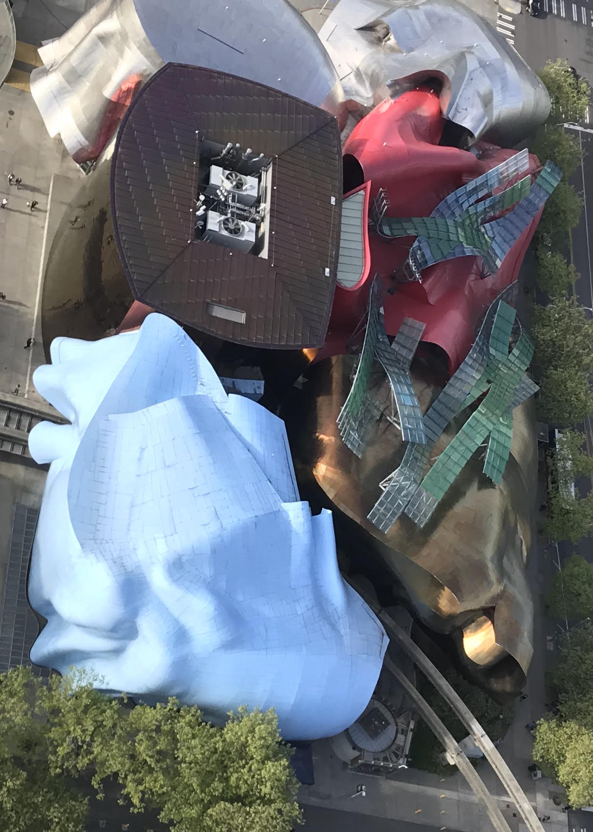
This is not a picture of chewing gum or discarded candy wrappers. This is an aerial image of Seattle’s Museum of Pop Culture (MoPOP), taken from the Space Needle’s glass elevator. The building, formerly the Experience Music Project (EMP), was designed by Frank Gehry and completed in 2000.
Most architects would agree that this was the project that Gehry took too far. Although the MoPOP has signature Gehry forms, the colors and exuberance departs from his more sophisticated compositions such as the Guggenheim Museum in Bilbao, Spain. I knew the project architect, and he left Gehry’s firm in frustration after its completion.
What is most intriguing to me about this project is the roof. The tops of buildings are not the place you expect to find elaborate, well-designed surfaces. Usually they get minimal design attention — perhaps a screen to block mechanical equipment from the street view. It is common for design efforts and money to be concentrated on areas of a building that are most visible. Infill buildings traditionally have one façade that gets design attention; a corner building gets two facades. Occasionally three or four sides of a building are visible and must be designed with the same intensity.
Understanding that this building sat next to the Space Needle and would be viewed from above by thousands every day, the design team treated the roof as the fifth façade.
More and more rooftops are being seen as opportunities rather than leftover space. More people are using their roofs as recreational/living space — perhaps to take advantage of a view. Uber just released a new design for an affordable air taxi. With an increase in air traffic and the introduction of ideas like Uber Air, will the roof become more important than the parts of buildings visible from the street? Will the roof become the primary building statement and entrance for the affluent traveler? What happens to the ground level of our buildings when air taxis become commonplace? It is exciting to speculate about the future of the fifth façade.
