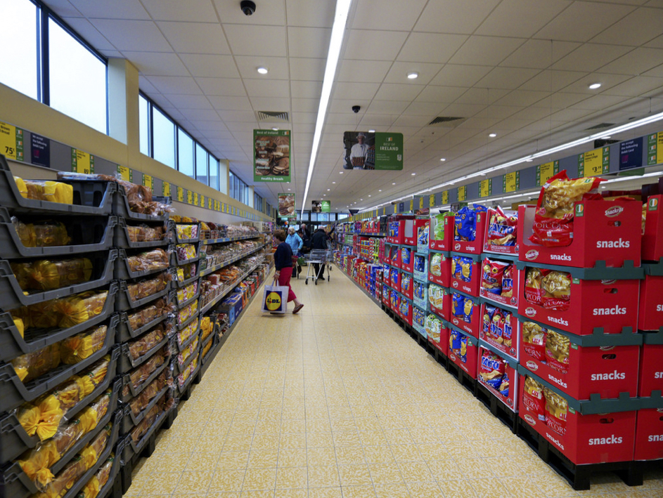
When I was a young designer, fresh out of school, my employer got a lucrative commission to be the architect for a successful warehouse grocery chain. When I saw the budget for their buildings and their most recent model design I got very excited about the potential. This was about the same time the firm SITE had published their BEST stores demonstrating what was possible when you thought outside the box store.
The principal of my firm wanted me to start attending meetings. However, he wisely asked me to sit in the back and instructed me not to say anything. The first meeting was attended by at least 20 highly paid executives and consultants. One of the main items being discussed that day was what tile to use on the floor.
Through an exhaustive value engineering process they had settled on an expensive Italian quarry tile that over the course of 20 years would pay off due to its durability and reduced maintenance. The immediate decision was simply which color tile should they select: a classic terra cotta or an off-yellow tile suitable for a high security prison?
Knowing the color palette of the store and the logo, which appeared as if an 8th grader had designed it, the terra-cotta tile was the obvious choice. It was painful and took a great deal of self-control on my part as everyone around the table weighed in on this decision. After a quick calculation, estimating the salaries of the individuals sitting around this enormous conference table, I concluded they were burning close to $500 every minute. Certainly they could use their time more effectively; shouldn’t they leave this to the designers?
About 30minutes later, after everyone had expressed their opinion, the CEO weighed in, “If we place the terra-cotta tile in our stores it will look nice, but our customers will subconsciously think they are paying for the floor.
We will use the puke colored tile.” End of conversation, decision made. I was stunned and as the thought process sunk in I spiraled into depression. It was disheartening because all my training was focused on making spaces beautiful and pleasant. What was perhaps more disturbing was the fact I couldn’t find fault in a decision that so precisely expressed their business model.
In the passing weeks I processed this devastating revelation and considered abandoning the profession more than once. Honestly, this experience still haunts me. Smart, strategic design might actually necessitate making a space purposely hideous. This story is not an excuse for the general ugliness that we so often are surrounded with — that is clearly a product of lazy thinking, neglect and ignorance. I like to believe that if confronted with this challenge today I could propose something so ugly that at some point it would become beautiful. The ultimate challenge — making ugly look good.
